JefferZen Meditation App
Challenge:
Create a mindful meditation app designed to target Thomas Jefferson University student body. Research, ideate upon and build a meditation application that .
My Role
Brainstorming, Research, Storyboarding, Wireframing, Design, Branding, Concept Creation, Web Development, Pretotyping (as per 'The Right' It book), Prototyping
"How Might We..."
Everything starts with a “How might we” statement. For my project the statement that inspired my app endeavor was “How might we introduce a new meditation habit for students at Thomas Jefferson University”
The book “The Right It” authored by Alberto Savoia, who is known to many as Google’s Innovation Agitator, was used as a road map to test out several different methodologies.
Brainstorming:
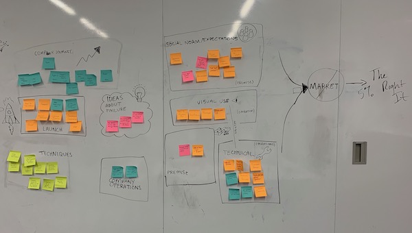
The brainstorming session was done as a group collaboration in order to get a better gather of all of the ideas and touch-points and in the categorization new connections and universal ideas come to the surface. It was after this exercise that I could better visualize the application as something that would include anonymous real-time user tracking and a leaderboard to incentivize the users.
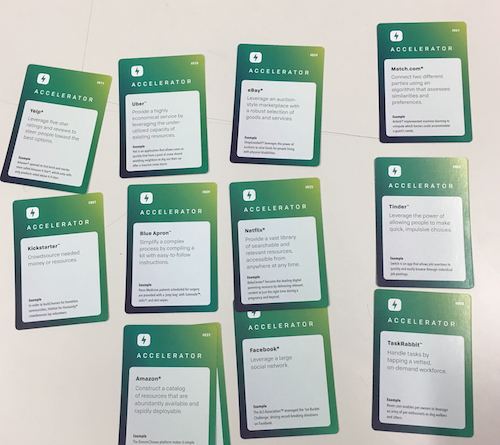
The techniques used in this session were Accelerator Cards and Affinity Diagramming.
MoSCoW Method:
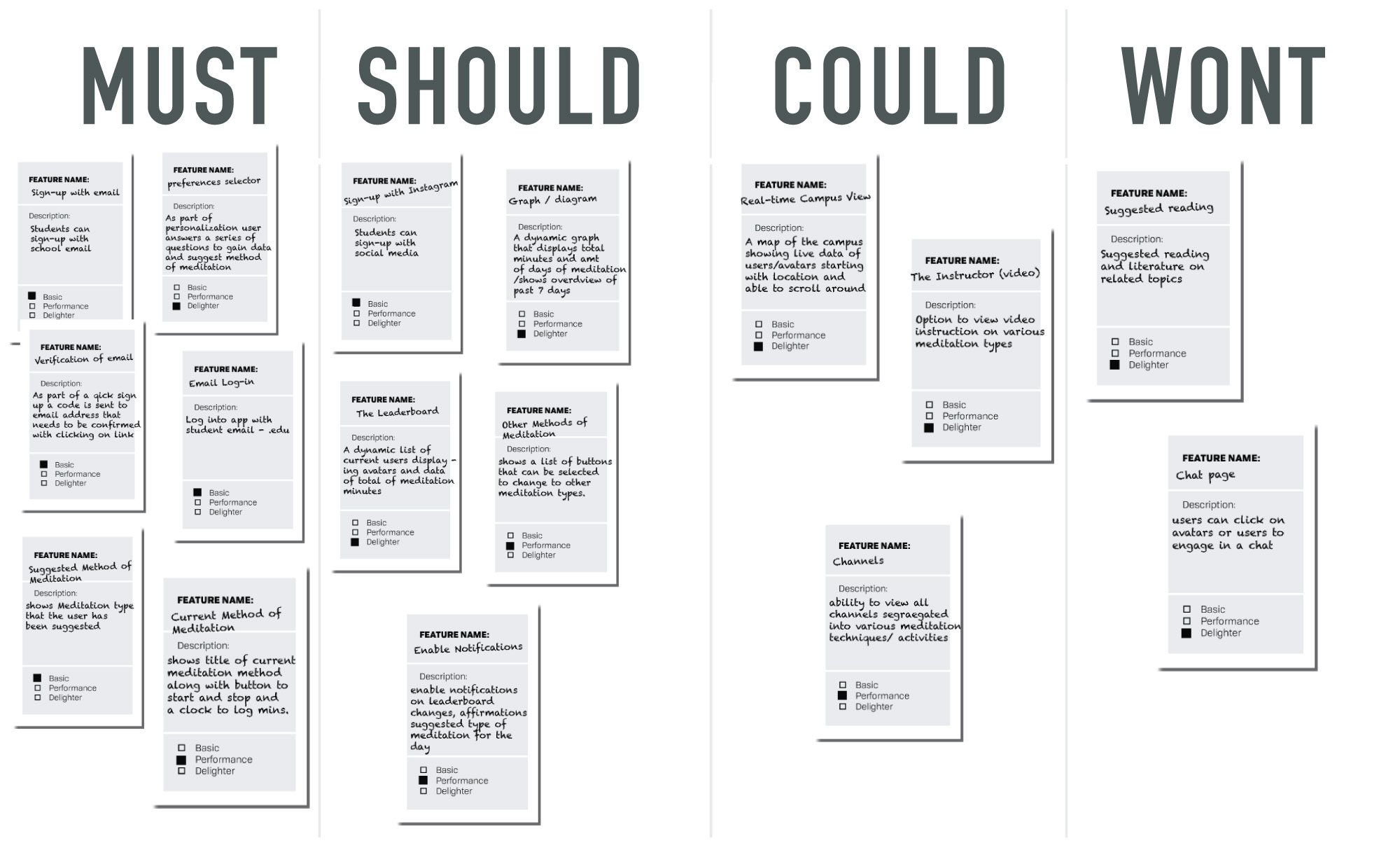
This method shows the possible features that could be included in the finalized concept. Taking all these features into account, it was my job to categorize them into features so that I could clearly see what might not be critical to the build and therefore could be left out of the meditation app.
User Flow:
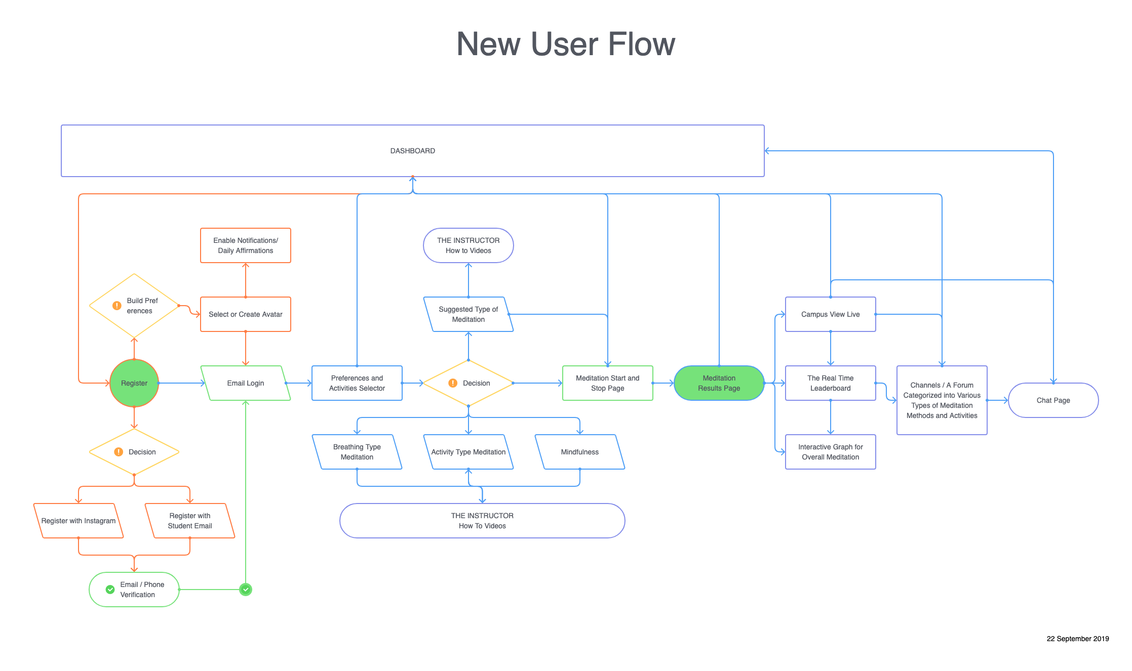
After deciding on the must have features to include in the application I moved on to creating the user flow for the app. The previous step was essential in helping me be more decisive and made for a cleaner creative process. The resulting user flow was easy to understand and gave more shape and specific direction to the application.
Ideation Through Storyboarding:
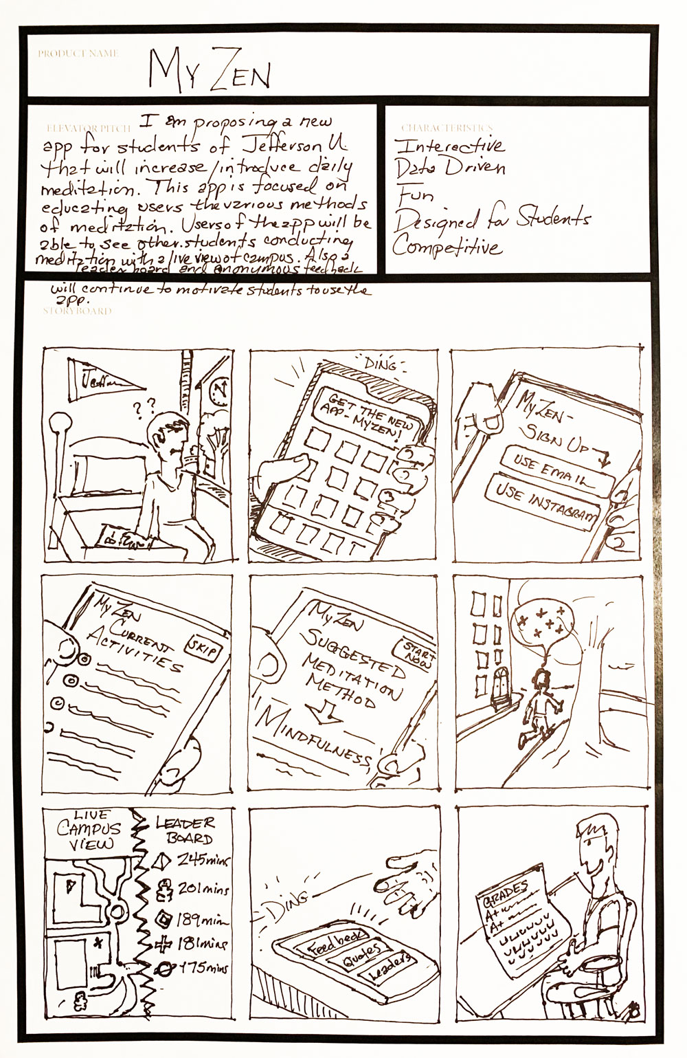
By storyboarding at this intersection of the creative process, I was better able to visualize how users / students would interact with the application. I established that the app would be interactive and would reach out through notifications to engage the user. The main goal of the app was to bring delight and fun to the idea of meditation. By doing this meditation would hopefully seem less stuffy and more approachable especially in a world where so many things are grabbing at people’s attention. I imagined something that also brought a little bit of competition to the mix using a leaderboard to keep students interest in the long run. Ultimately it would be my hope that students would see more intrinsic rewards of meditation as incensed confidence and improved mood leading to better grades.
Risky Assumption Matrix:
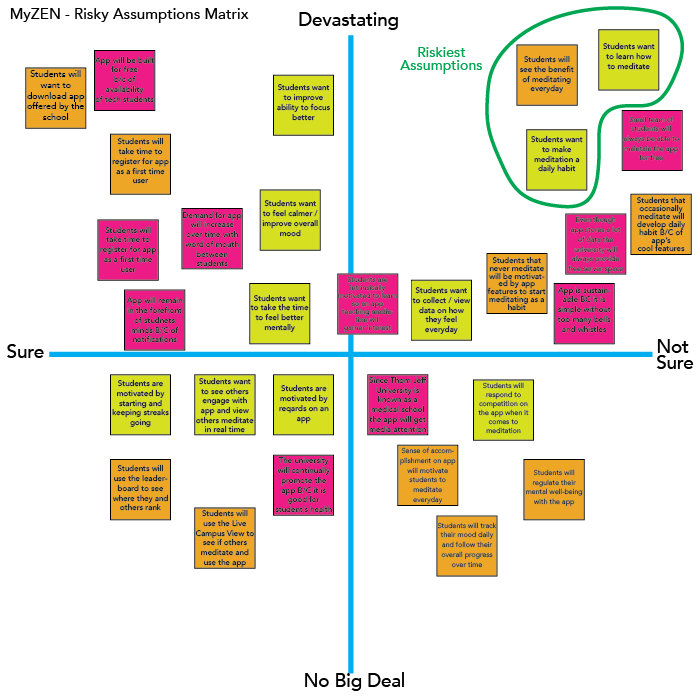
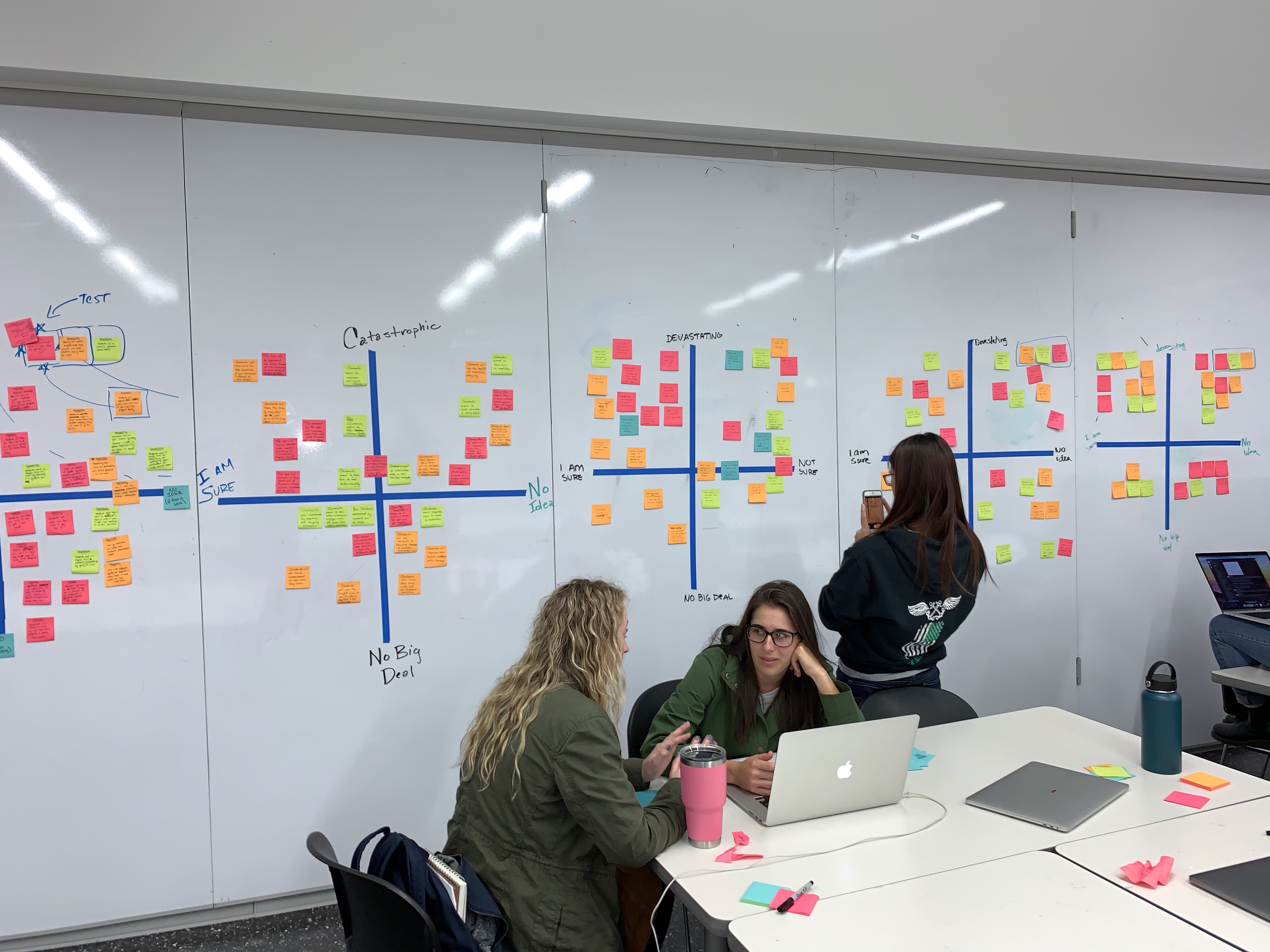
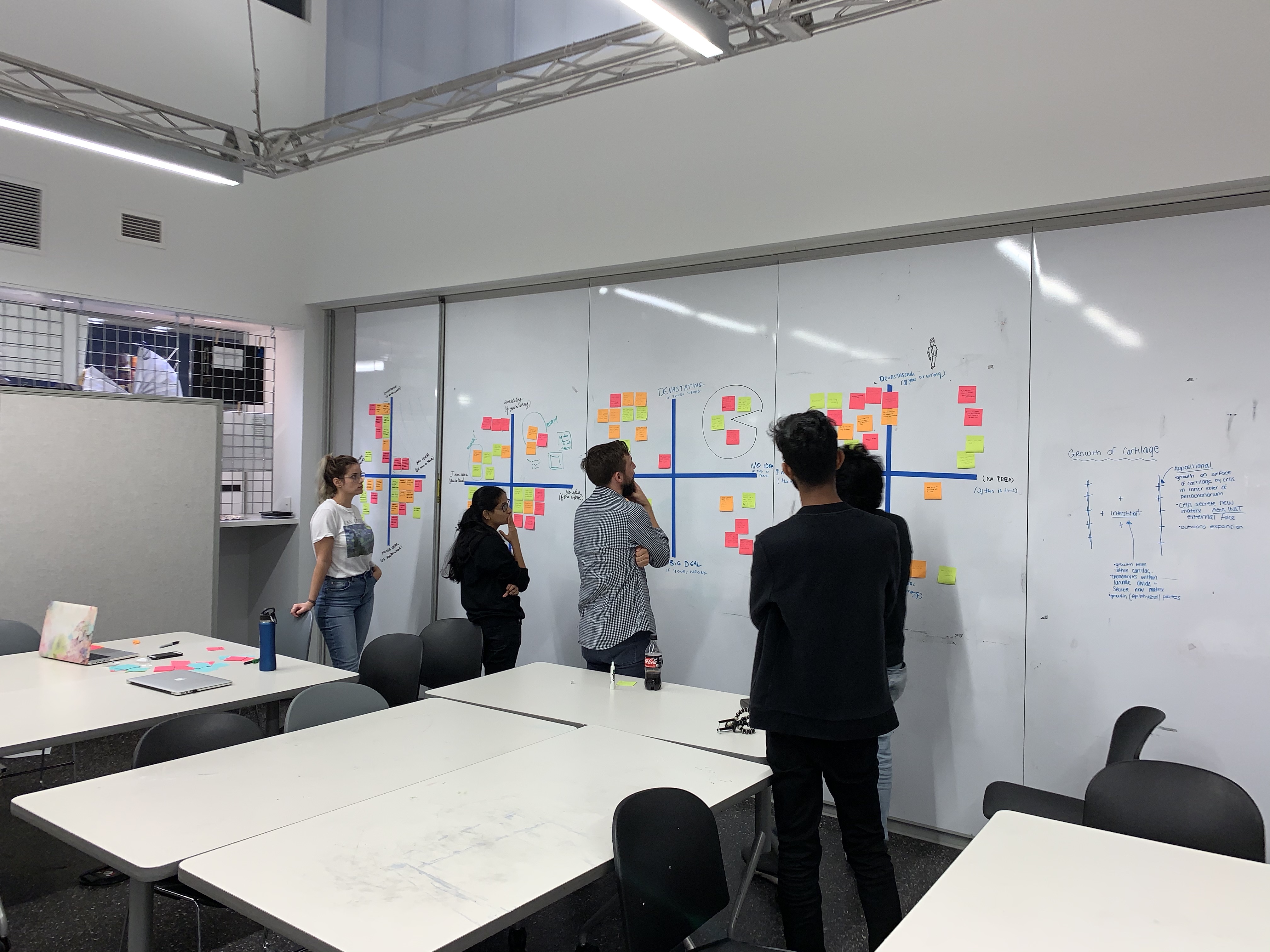
This collaborative session was assembled to help us as creators to get at the riskiest assumptions that could make or break our concept. Here with the help of my colleagues it was time to drill down on the assumptions that were most critical in the product being something of actual use and desire to users. Altogether we were testing for feasibility, viability and desirability. The 3 riskiest assumptions, turned out to be:
- Students will see the benefit in meditating daily
- Students want to learn how to meditate
- Students want to make meditation a daily habit
Using these riskiest assumptions as my guide I would look to bring my concept to market.
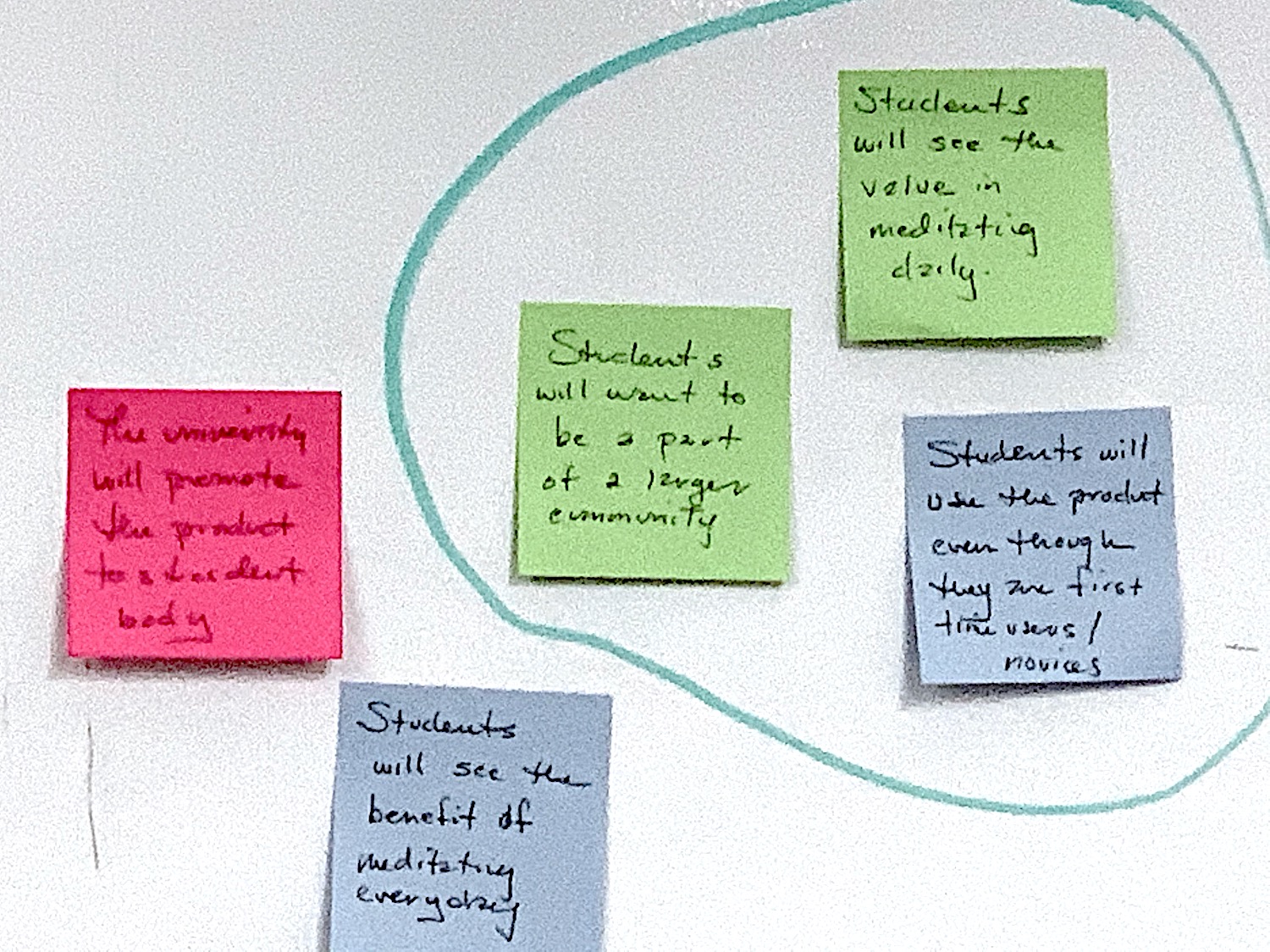
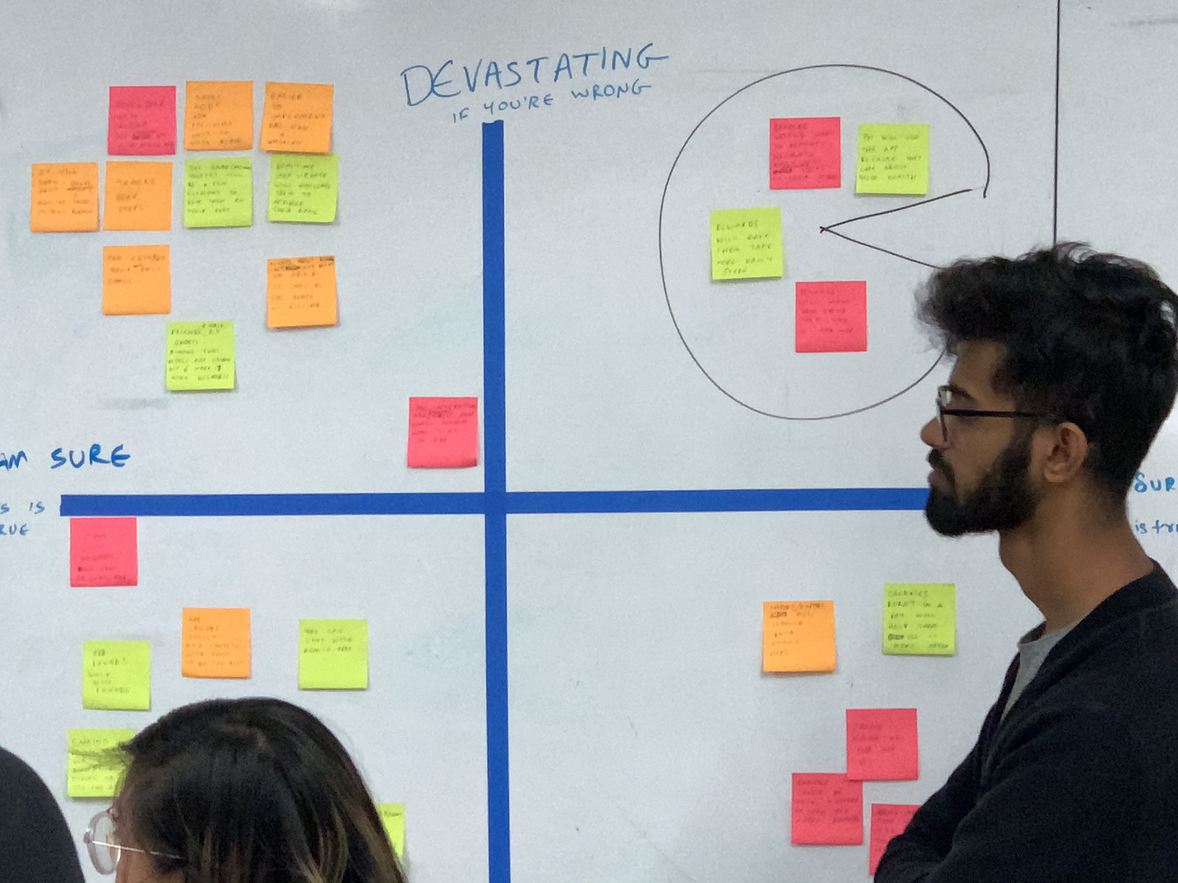
Risky Assumption Collaboration:
“Look & Feel” Collaboration:
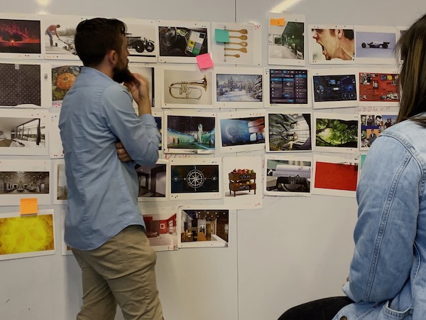
This step was a group effort to enrich the project through further collaboration. This session’s goal was to assist in formulating a look and feel for the application by experimenting with different inspirational images and photography to set a course and provide a visual backdrop.
Mood Boards:
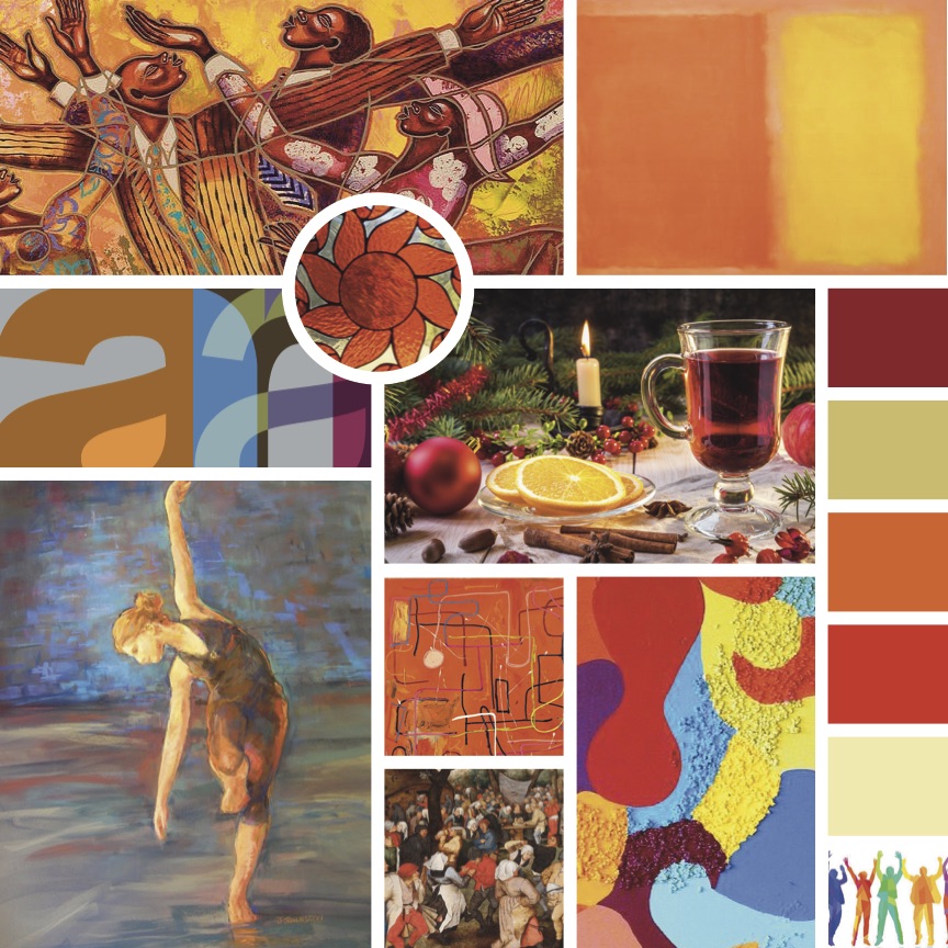
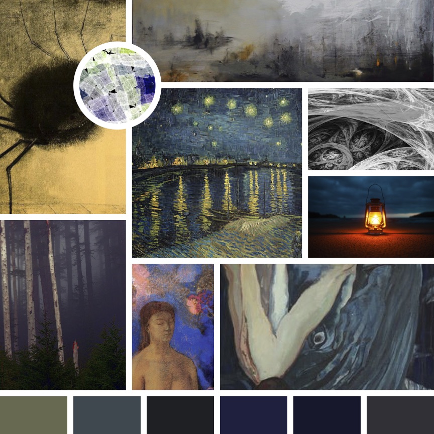
I was able to create a set of mood boards of possible directions to take the “look and feel” of the application. I decided to pick the mood board titled “Jubilation” that I created to infuse the app a playful quality. See other mood boards by clicking below…try to guess what each mood board represents as far as an emotion or feeling.


Low Fidelity Wireframing:
This is the step that helps brings the app alive. Each potential screen was sketched out with these low fidelity wireframes. See all the wireframes with ability to zoom by clicking below.
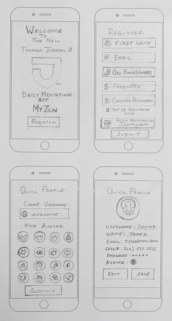
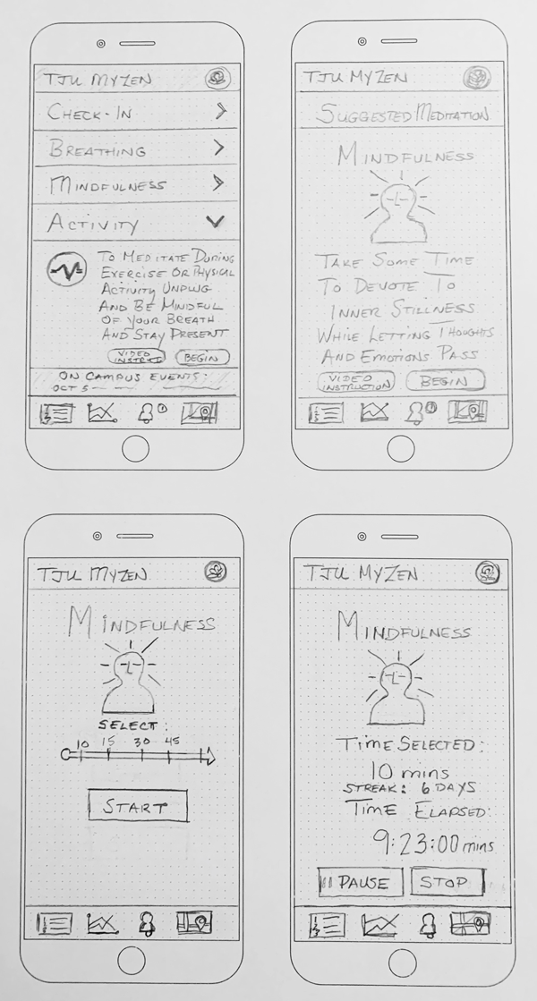
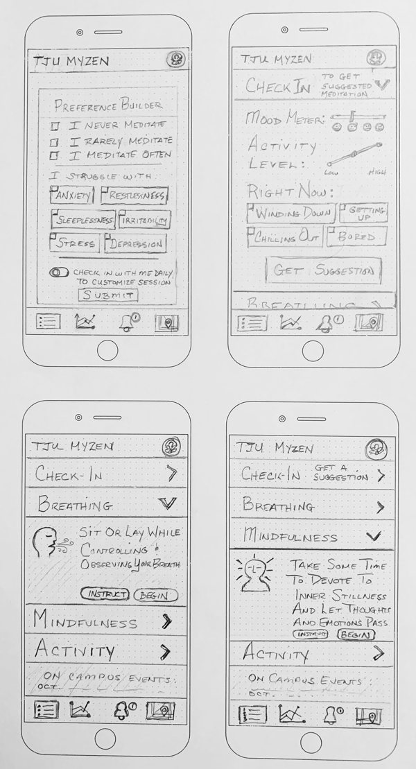
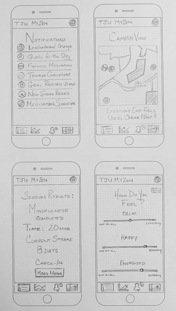

User Testing:
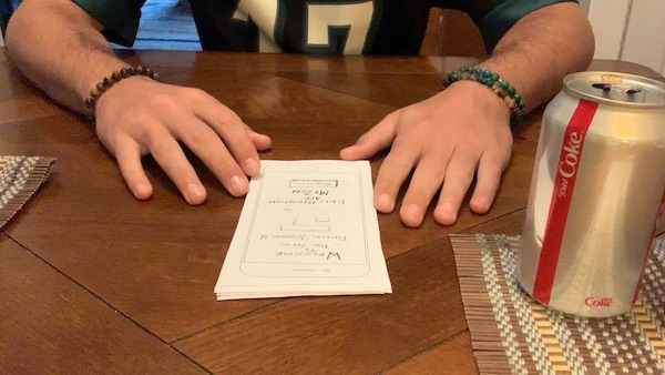
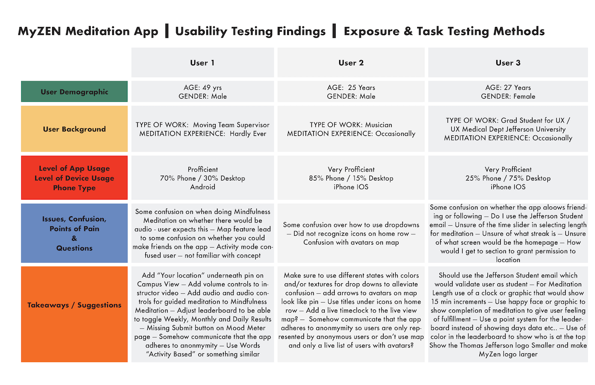
Now the most important was “Think Aloud” testing / User interviews. This part is where the learning rubber hits the road. So many gaps and opportunities are revealed and the feedback is invaluable. I have fun in this stage watching the interactions and seeing how subjects react to the screens.
The Pretotype:
Ok so first thing - I didn’t misspell Prototype - its a term coined by Alberto Savoia, Google’s chief agitator in his book he authored called “The Right It”. In his book he espouses several different cutting edge ways of getting direct and valuable feedback from users that he terms “skin in the game”. So a pretotype is supposed to be a very low cost, low energy way of getting your concept in front of real potential users of your product. By doing this you mitigate the risk of spending a lot of time and money in building something that people simply don’t care about. So the pretotype is before the prototype…the direction or even the very existence of a prototype will ultimately be dependent on the market’s interest to your idea. Also at this stage I changed the name of my app to JefferZen Meditation App.
The Moving Parts:
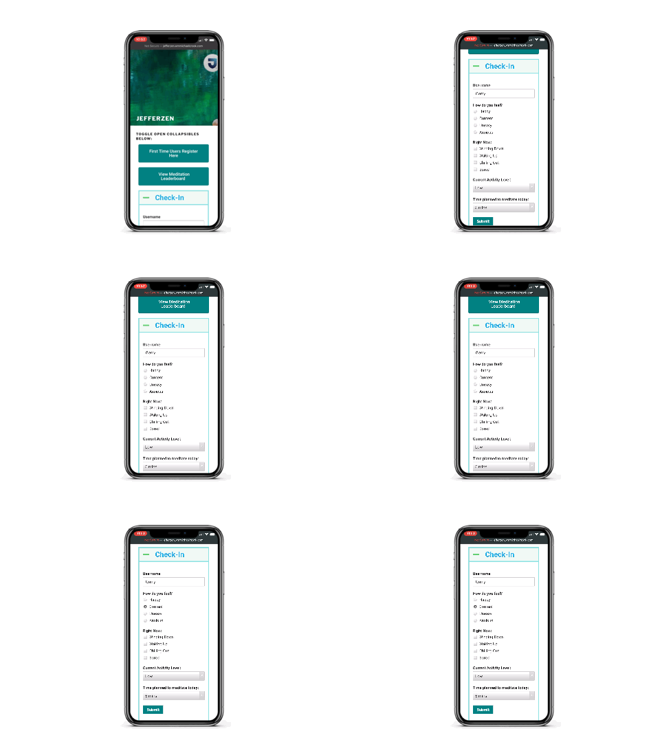
Here is what went on behind the scenes in order to put together the Pretotype mobile app.
The App Testers:
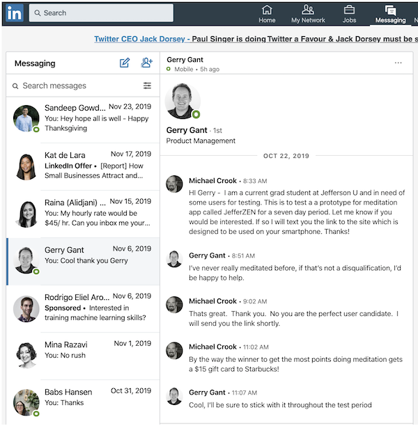
“Hi _____ - I am a current grad student at Jefferson U and in need of some users for testing. This is to test a a prototype for meditation app called JefferZEN for a seven day period. Let me know if you would be interested. If so I will text you the link to the site which is designed to be used on your smartphone. Thanks!” So this was the message I sent out to some LinkedIn contacts that I felt could help me with my research.
I picked contacts that were acquaintances or professionals through LinkedIn - so I could get a solid and authentic peer review.
The Backend:
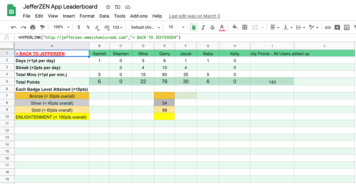
I needed to simulate a leaderboard that actually kept score to spark the competition that was going to be integral to the app’s success in keeping users engaged. I used Google Sheets that I embedded in the mobile website. This technique is known as the “Mechanical Turk”.
The Messenger:
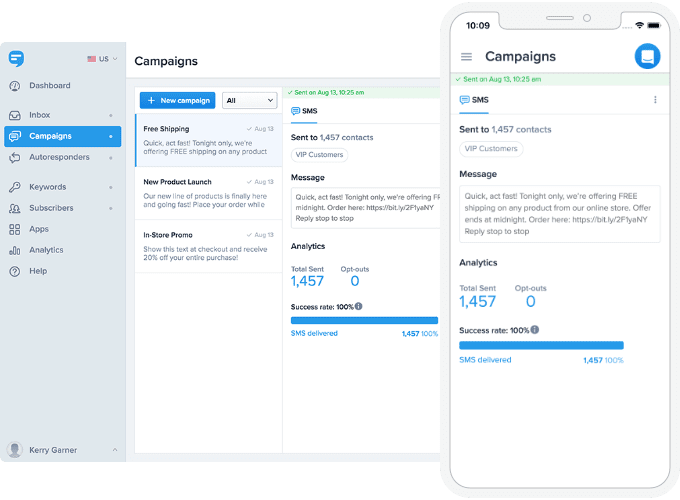
Doing it the right way is important to get results that have integrity. I used SimpleTexting platform in order to make sure users had to opt in and that I was texting each time from the system so that users could opt out at any time. I did not want to abuse the trust I had been given by the subjects of my user testing experiment. Also using this tool was easy to send out notifications to multiple users or groups and placing shortened Bitly links back to the front end website or to the Google Sheet Leaderboard.
The Build / Prototyping:
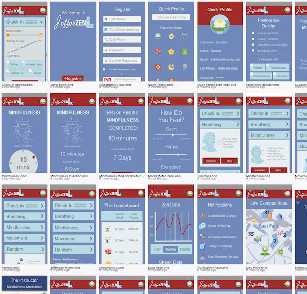
Finally it was time to build out a prototype of the JefferZEN Meditation App. The goal was to build in delighters and fun animations using Thomas Jefferson’s likeness. I wanted to create something that aligned with students current desire for personalized products at the Center City and East Falls campuses. Also the leaderboard and a live campus view would be a vlanding spot coming from links embedded in notifications sent via text. Also a preference builder would help first time users and novice meditators to feel more open to starting a meditation habit.
Skin In The Game:
4 out of 7 users remained engaged in the application throughout the testing period. This success rate of 42% points to the fact that the concept and execution of the application would align with my expected desire to reach at least 25% of students to create a meditation habit.