The Arc of Philadelphia (Redesign)
Challenge:
Take current website for the non-profit organization The Arc of Philadelphia and audit the website, conduct interviews and UX research and give recommendations for a redesign.
My Role:
Information Architiecture, Audit Websites, Hueristic Evaluation, Persona Development, Brainstorming, UX Research, Wireframing, Design, Branding, Web Design, Mobile App Design, Prototyping, Slide Deck creation, Creatives, Stakeholder Interviews, Survey Creation, UX Design, Journey Mapping, Mock-ups and Stand-ups / Presentations.
Team Members:
Andrej Witkowski, Rishika Dall, Abhilash Bhakre

Who our client is and what is their mission:
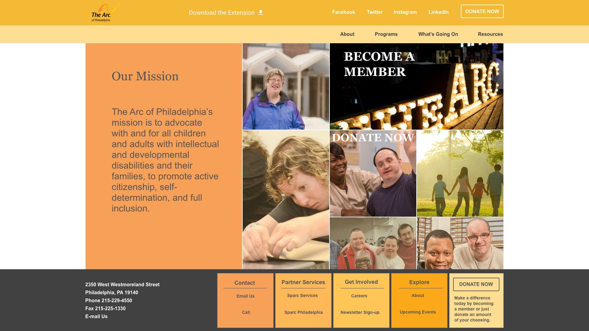
The Arc of Philadelphia’s mission is to advocate with and for all children and adults with intellectual and developmental disabilities and their families, to promote active citizenship, self-determination, and full inclusion.
Conducting UX Research:
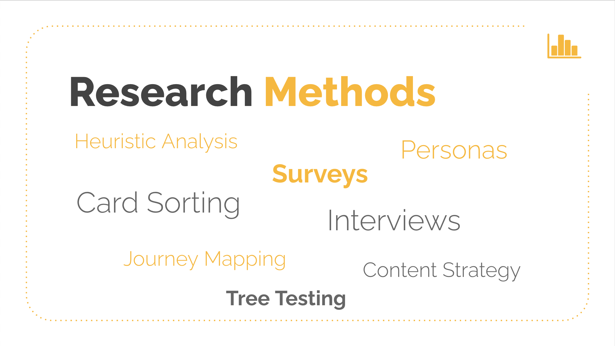
To set out on our project, the team must first need to come to a concensus on the methods of our research that we will employ to get insightful knowledge into what will be needed to improve the overall experience that users have when reaching out to The Arc of Philadelphia for support.
Some examples include: Personas, Surveys, Journey Mapping, Content Strategy, Tree Testing, Interviews.
Heuristic Evaluation:
Several tasks were assigned, one set for each team member, to evaluate the effectiveness of carrying out a specific task on the website. The first task was to make a donation on the website. The second task was to find programs offered by the Arc of Philadelphia. The third task was to learn about the organization.
Task: Make a donation
The first and one of the more crucial tasks for a user to complete on the Arc of Philadelphia website is to be able be to make a donation. Since funding is one of the biggest pain points for this non-profit organization it is vital that a donor would have the ability to make a donation on the site without a lot of difficulty.
Assessment Goal: Can users easily locate where to make a donation on the desktop website?
Finding: “Donate Now” is merely a text link and not a button and no color is used to catch the eye
Severity: Critical
Assessment Goal: Can users easily locate where to make a donation on the responsive mobile version of the site?
Finding: The “Donate Now” link is buried at the bottom of what looks more like a sitemap than a menu / text too small to click on
Severity: Critical
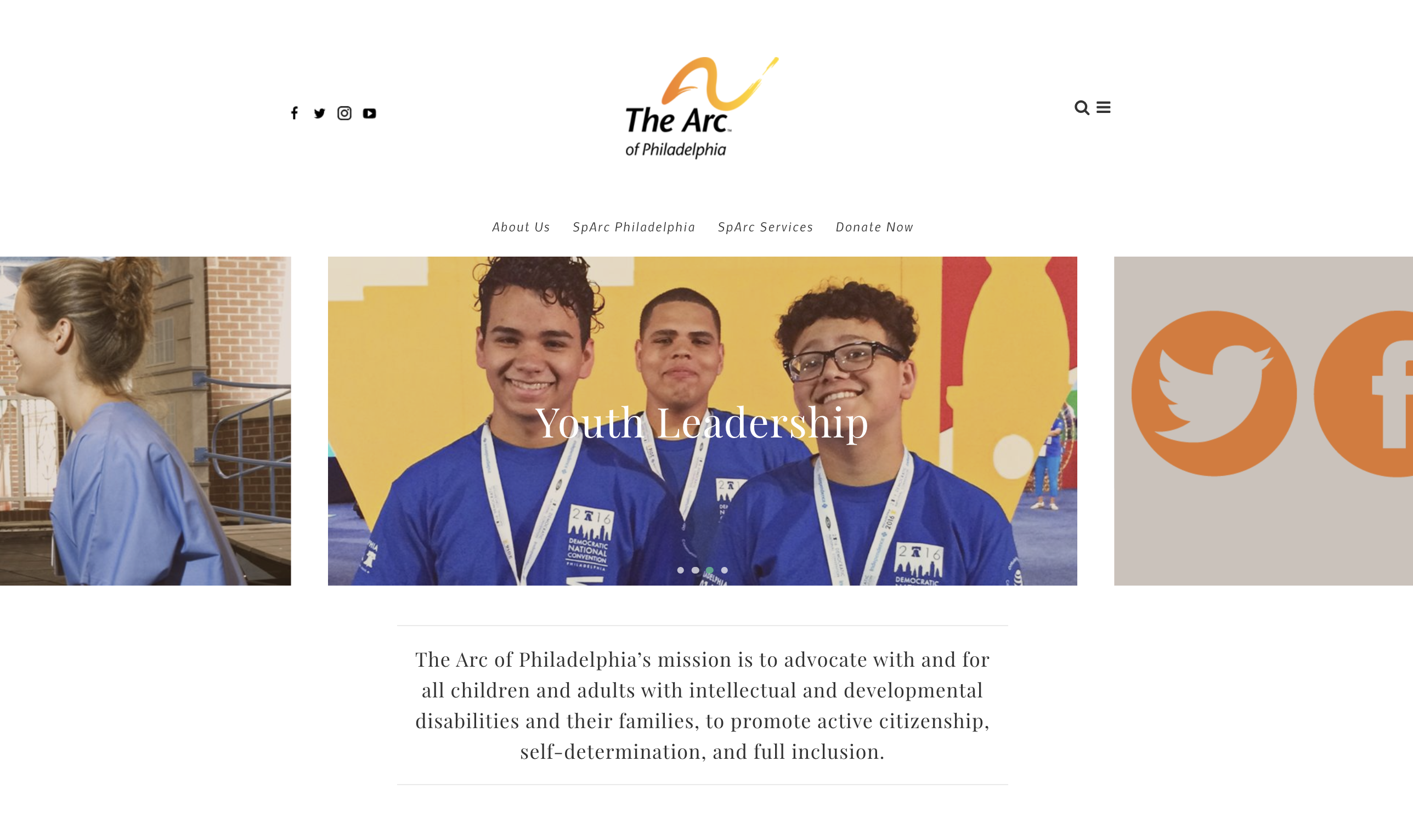
Assessment Goal: Can users with disabilities access the make a donation feature without difficulty on the site?
Finding: For mobile users the Donate Now text link drops below the image and is just a link instead of a button. For those users with issues with sight or dexterity, when clicking on the hamburger menu the Donate Now text link is too small to see very clearly on mobile and would be difficult to click on as well.
Severity: Critical
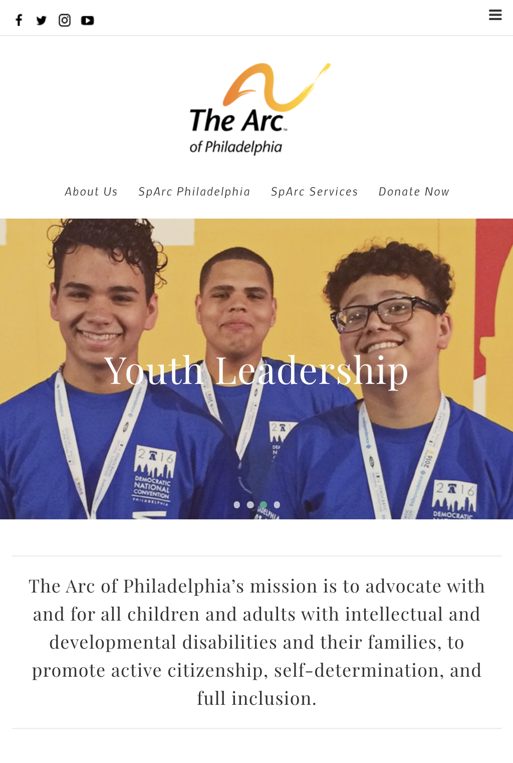
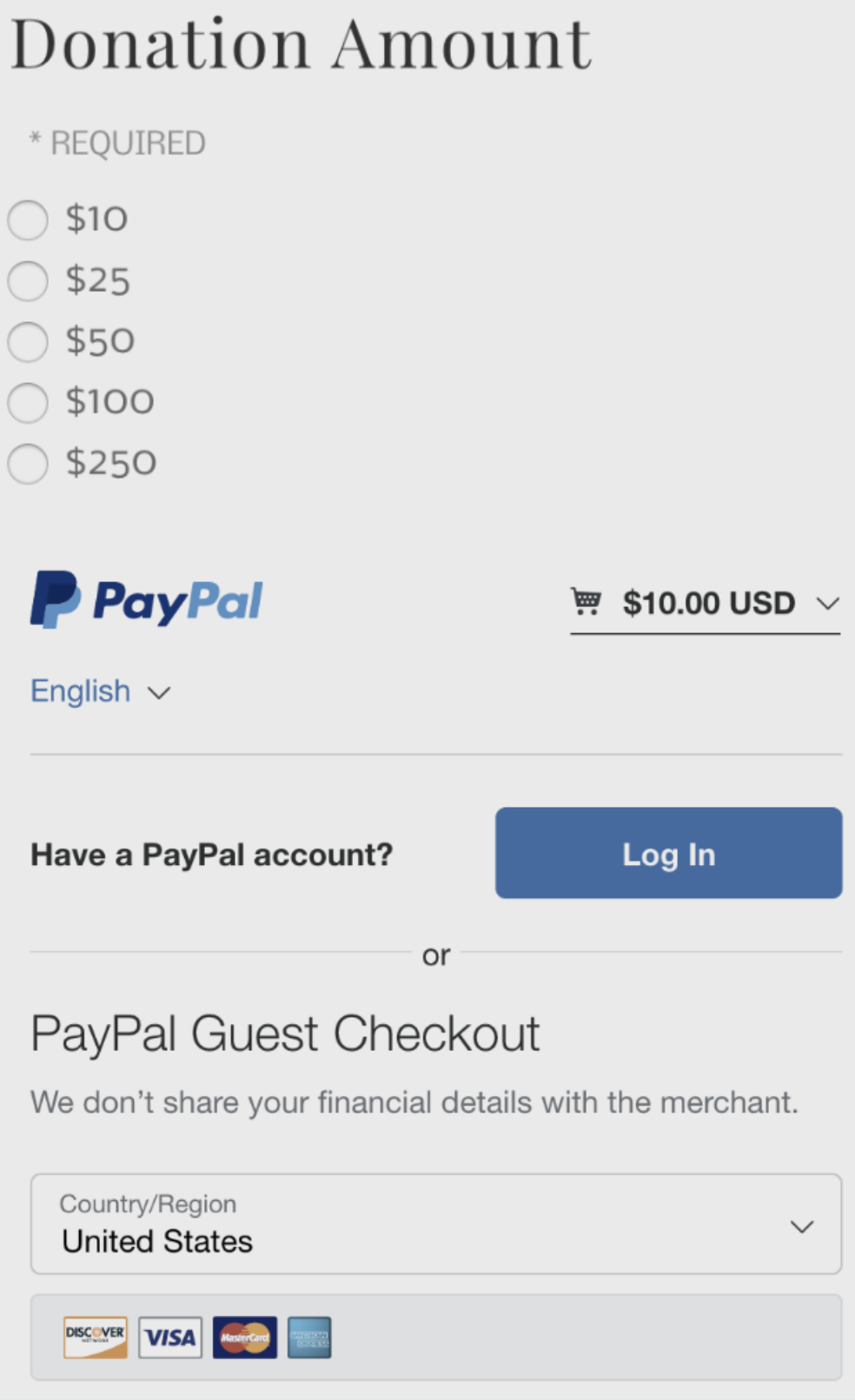
Assessment Goal: Is the path to task completion of making a donation obvious and free from distraction?
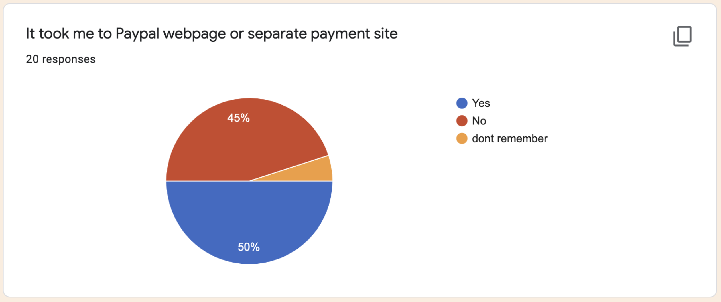
Finding: The donation link goes to a separate Paypal webpage where the transaction occurs, which can be distracting especially for first time users since there is no branding and the return link is very small at the very bottom of the Paypal page. Also “Send” button at the bottom of form on web page is a little misleading.
Severity: Medium
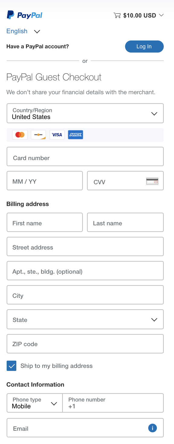
Assessment Goal: Is there support / help information available? Can you contact a real person?
Finding: There is no obvious way to contact or email someone if you had a question about donating online. Also an issue of credibility is there is not hint as to, if or how, they use the submitted info for marketing purposes or sharing with other organizations.
Severity: Critical
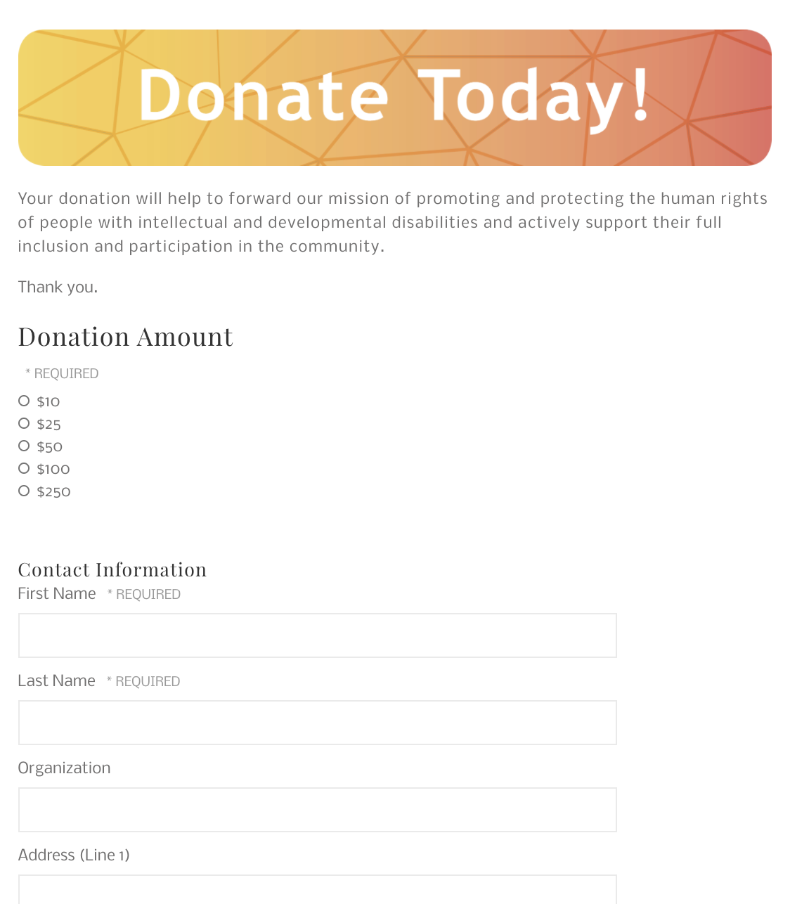
Assessment Goal: Can a user complete all the tasks or options available that they would desire to accomplish?
Finding: The ability to make monthly automatic donation is not available. Also the ability to enter a custom dollar amount is not available to the user either.
Severity: Critical
Identify and Interview Stakeholders:
It all begins with interviews. By sitting down with various users and stakeholders, the team can get a better handle on what the goals, points of pain, and opportunities are. This is the best place to start to give the project purpose and direction.
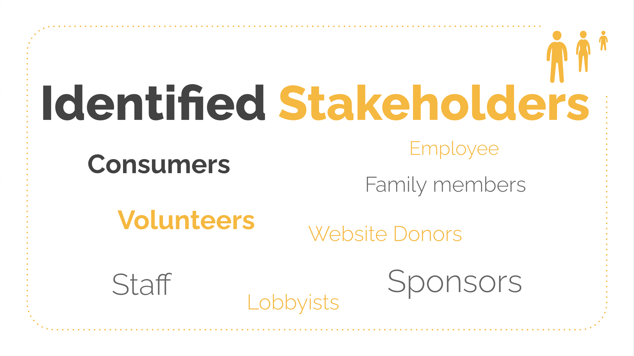
We were able to secure 3 different interviews at different levels within the organization.
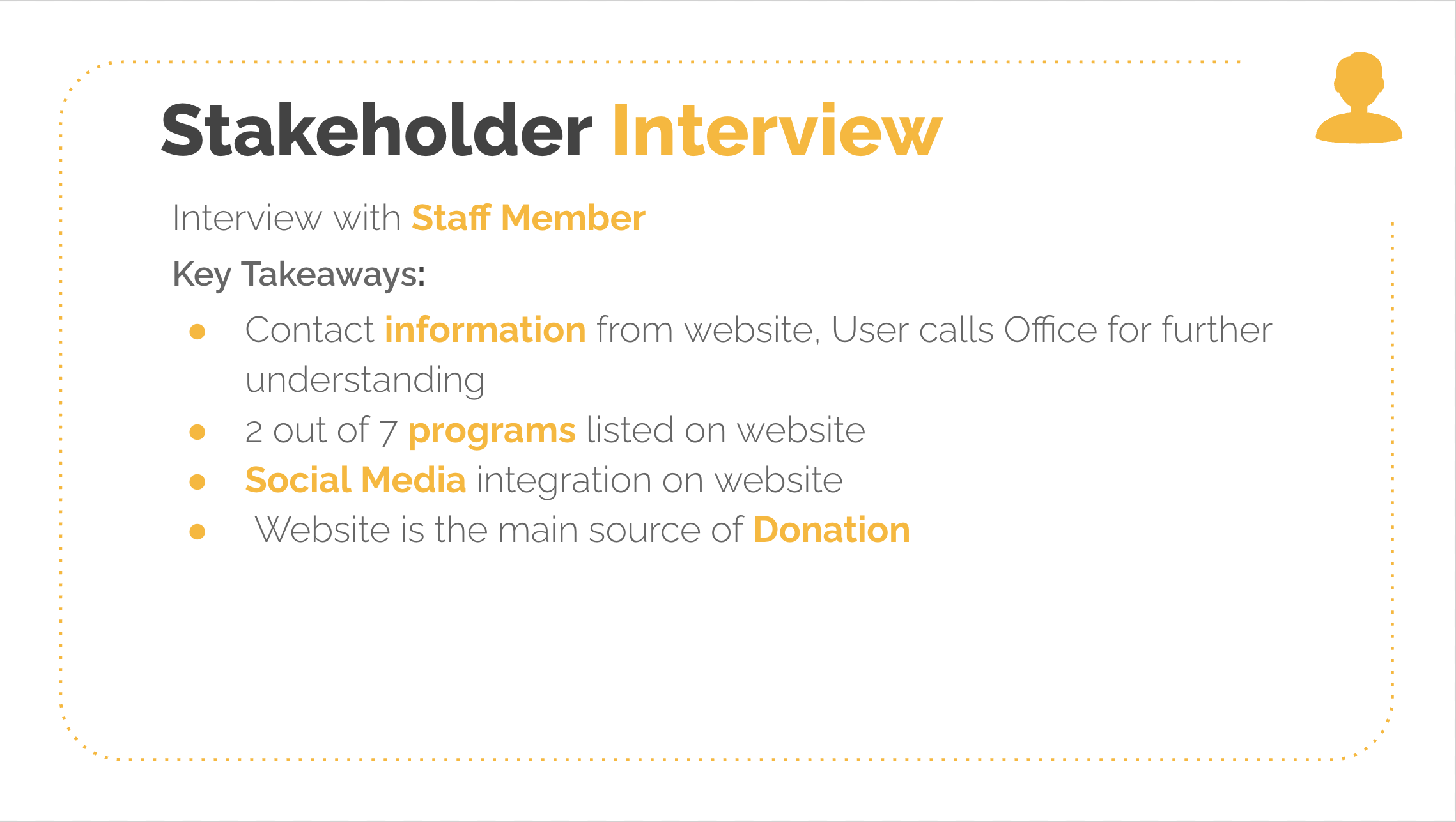
Below is the link to a presentation deck that was prepared after interviewing the Director of The Arc of Philadelphia
Stakeholder Interview Insights:
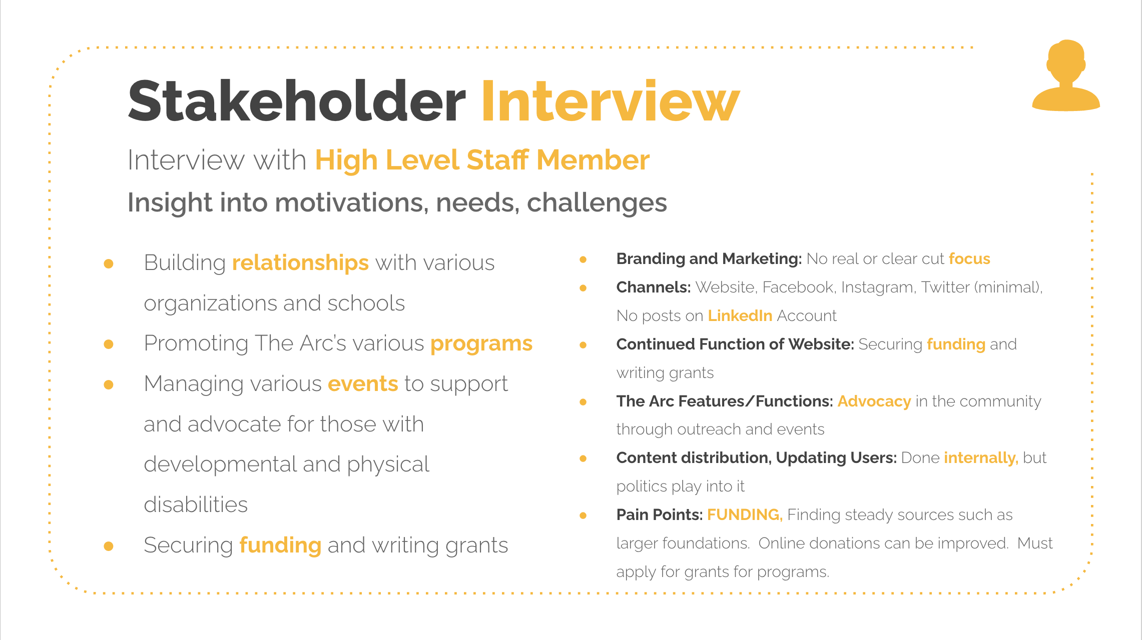
As time went on the team was able to secure more interviews of various stakeholders at The Arc to get further insights.
Interview Synthesis:
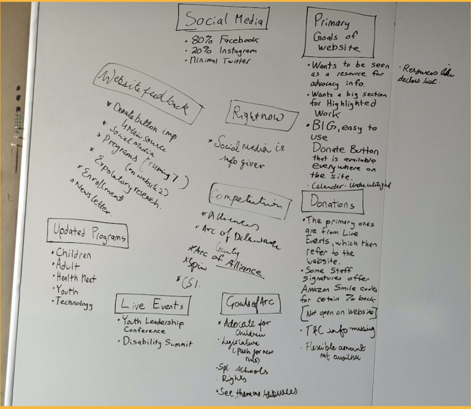
Getting the team together to pull all of the insights and ideas together was important. Whiteboarding our ideas we were able to get our ideas and continue to make a plan for further research.
This was the process of starting to gather the bits of pieces and start to assemble into an organized and bigger picture of where the website was falling short and how each stakeholder was affected by the ineffectiveness of the website.
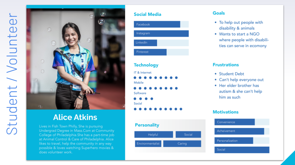
Persona Development:
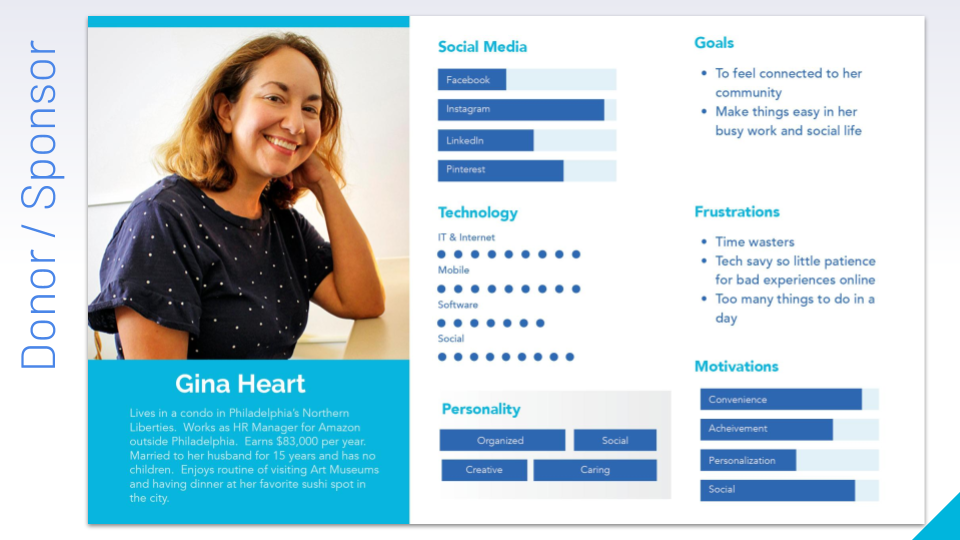
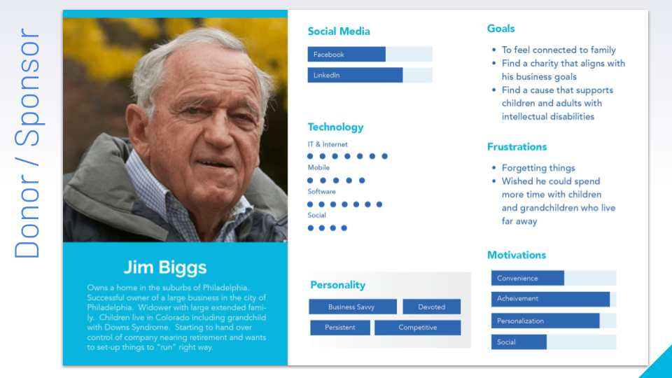
After our interviews and doing some sythesis of various insights, potentials Users for The Arc Philly website started to come into view.
Online Survey:
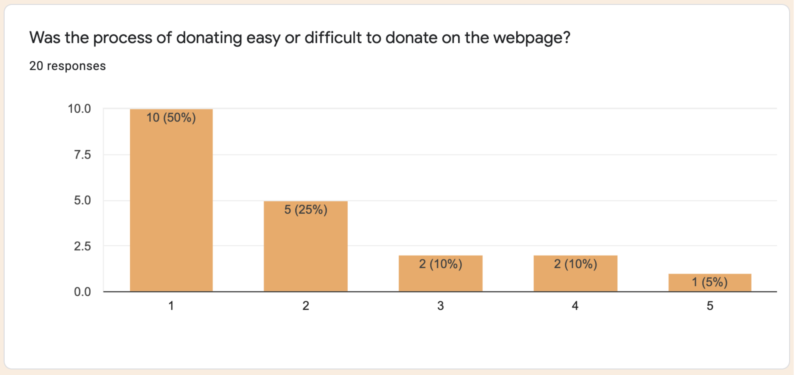
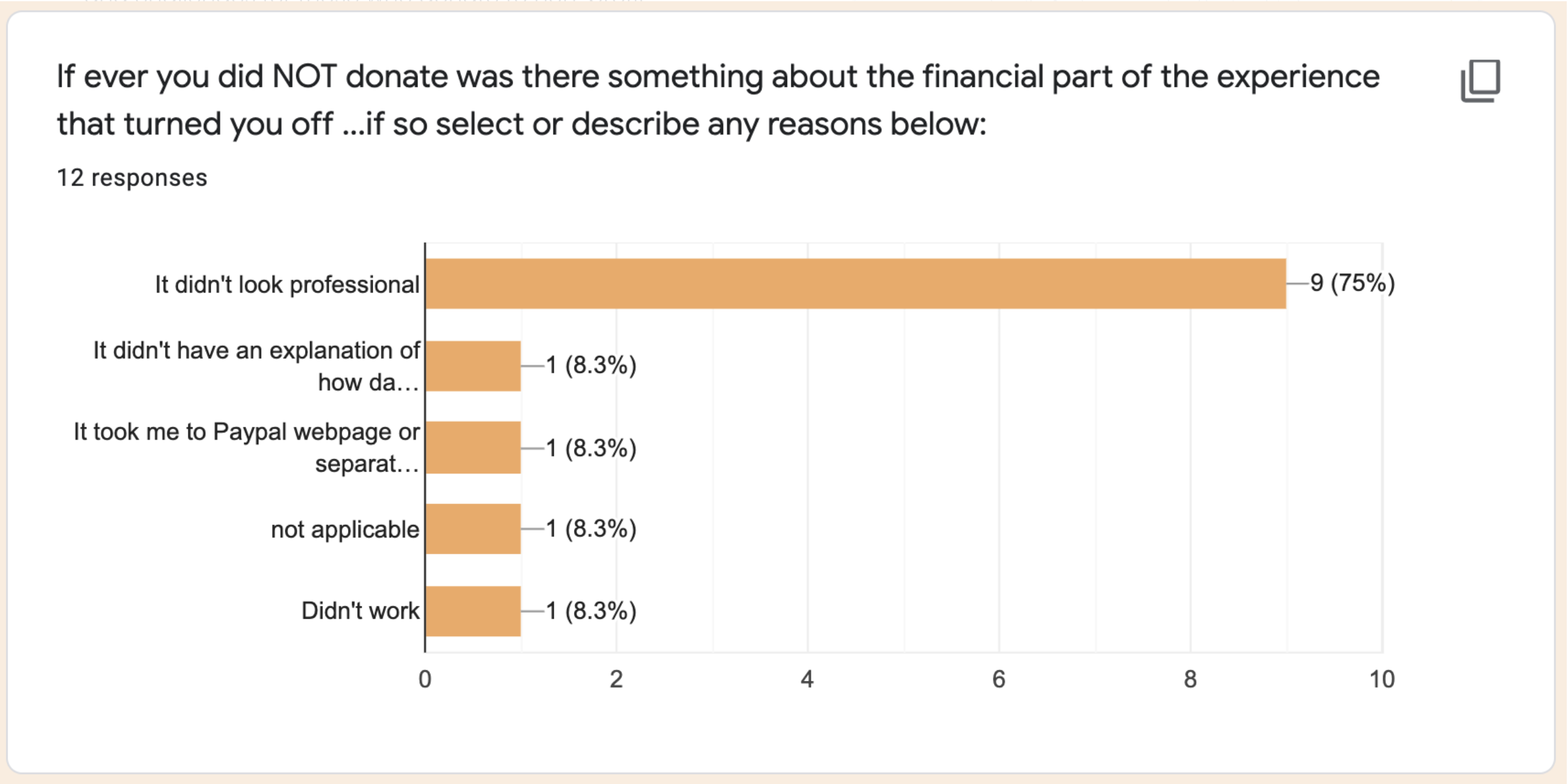
Since we had difficulty securing interviews from The Arc of Philly's end users due to privacy concerns, we pivoted and decided to send out a user survey to our collective audiences leveraging social media. A Google survey form was created to capture user data and attitudes to donating online to non-profit organizations.
Online Survey Results:
Card-sorting Exercise:
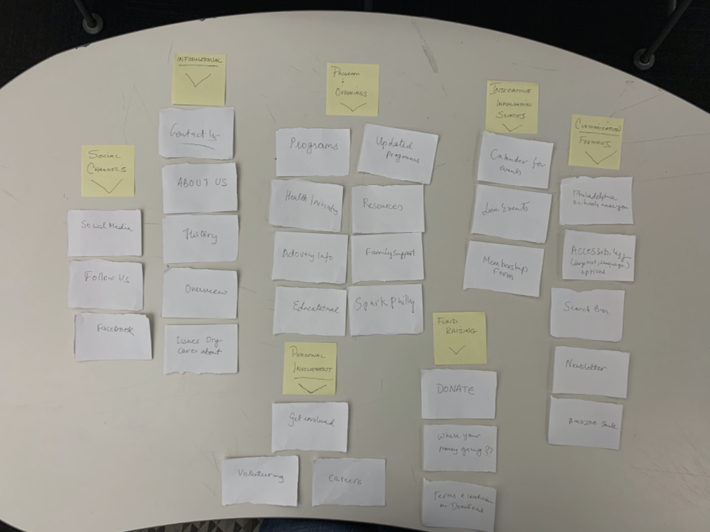
In order to get a better understanding of how the website presents information to it's users and the possible ways to organize this information - a closed card-sort was executed. This led to further understanding of problems and to enhance and change some of our recommendations.
User Needs Identified:
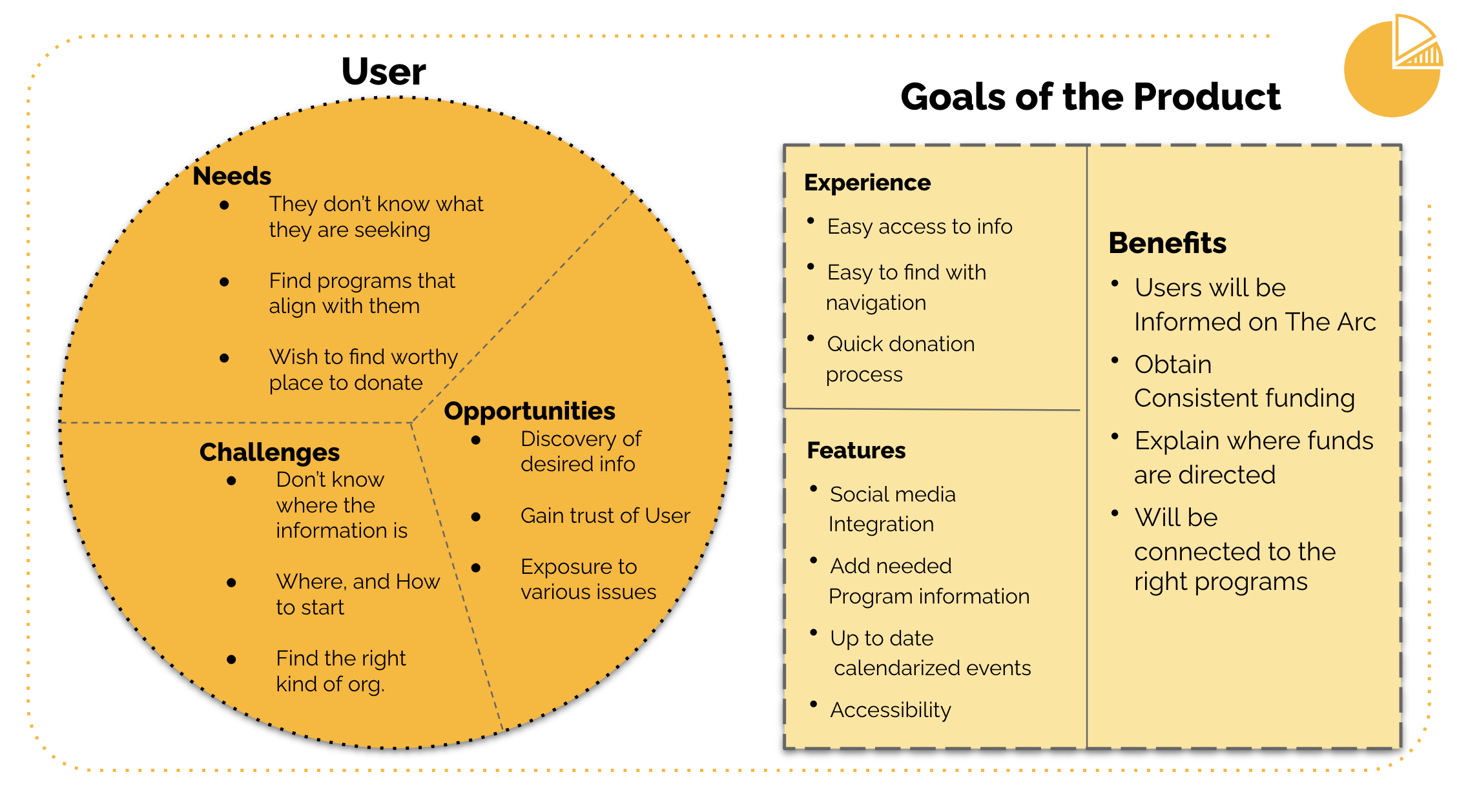
By going through our survey data we were able to get a deeper, more meaningful understanding of what our users need when coming to The Arc of Philadelphia website. Here we can see the experience and features required to have a beneficial experience on the website. This helps us better understand the shortcomings of the current state of the website and how various channels provide information to the user.
The Journey Map:
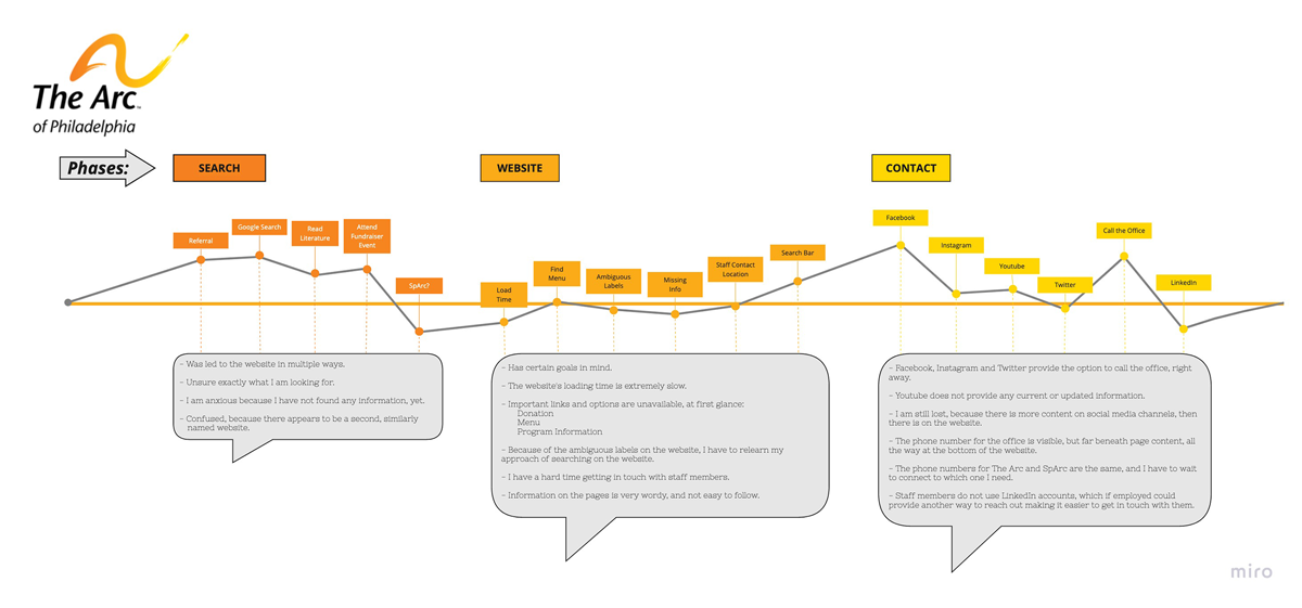
Below is a journey map of the phases and experience related to establishing a connection or contacting The Arc of Philadelphia. The points along the continuum are relative to the main median line and speak to how that touchpoint rates overall. As can be seen the website is very weak in comparison to all other methods of establishing contact with The Arc of Philadelphia.
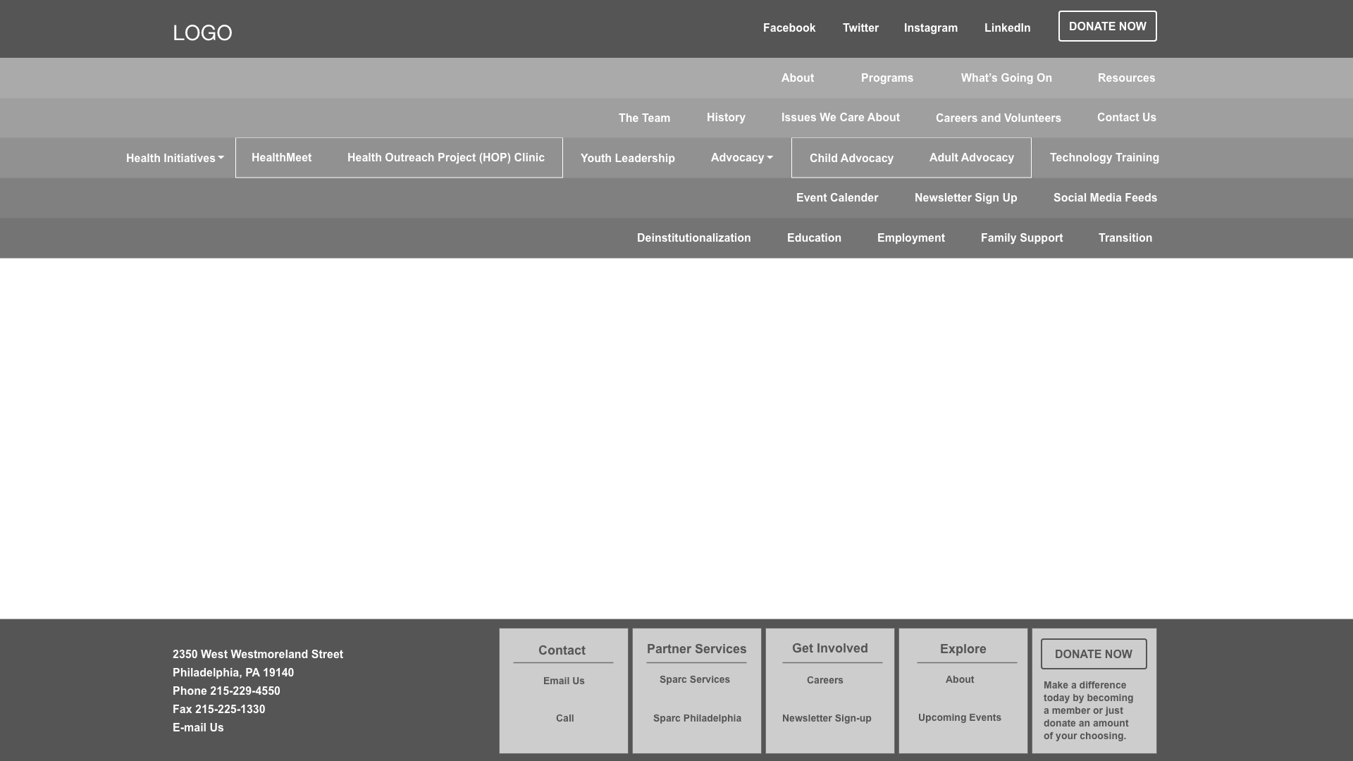
The Revised Site Architecture:
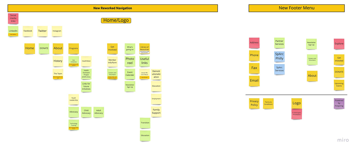
An overhaul of the original site structure was needed to simplify the experience for the user.
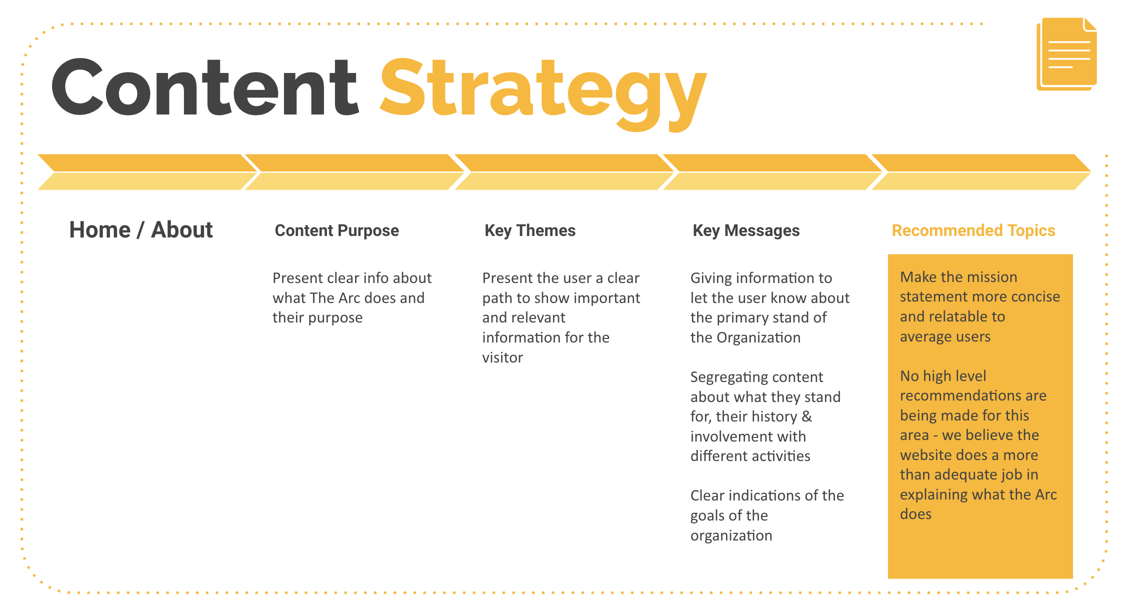
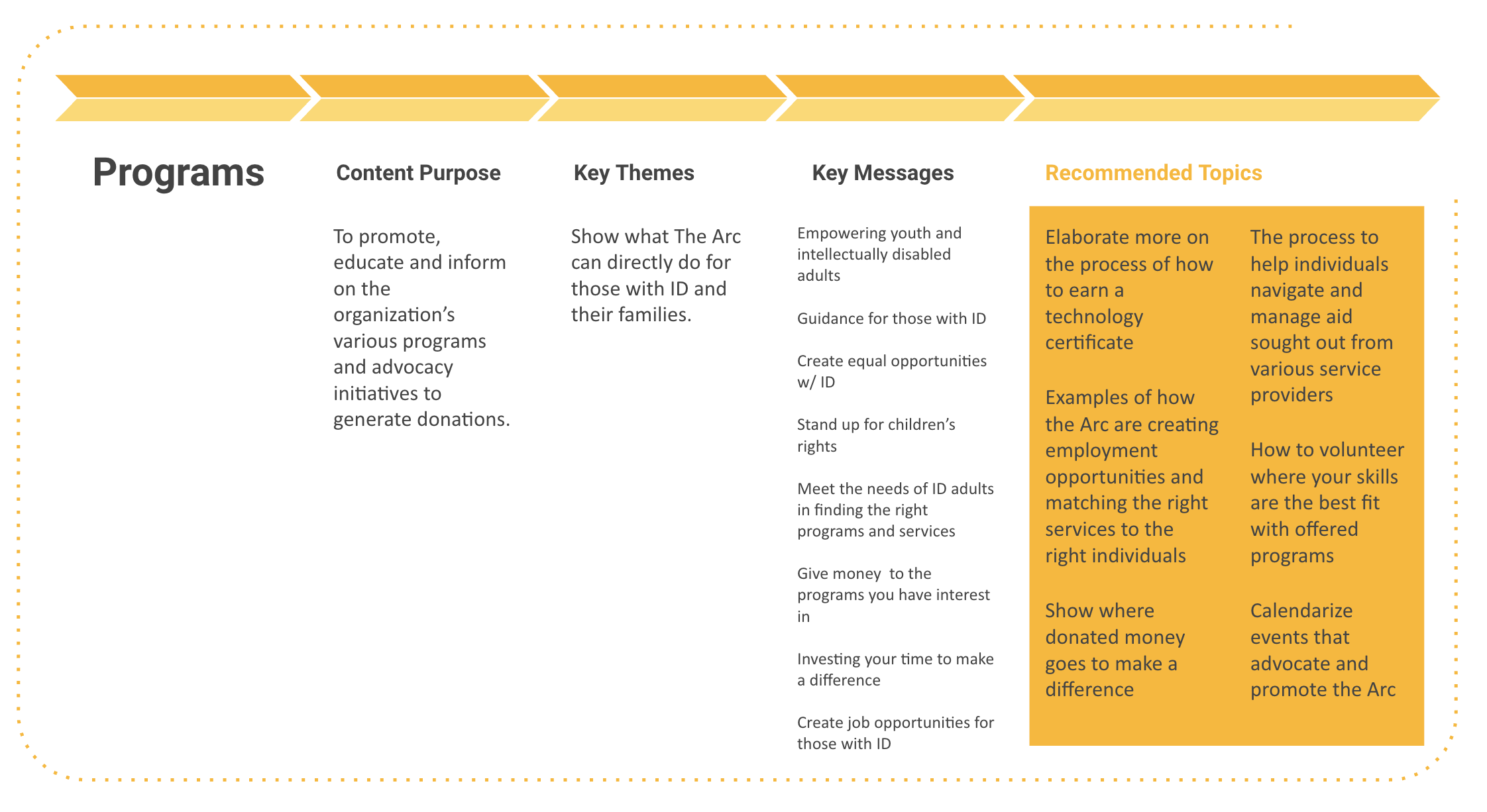
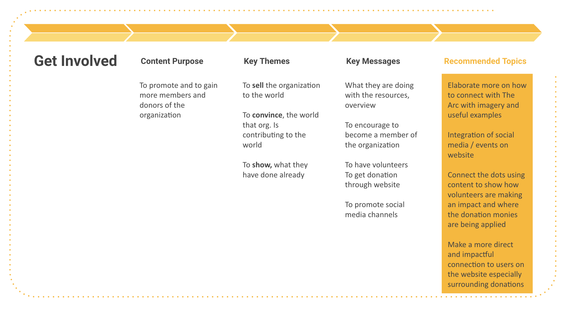
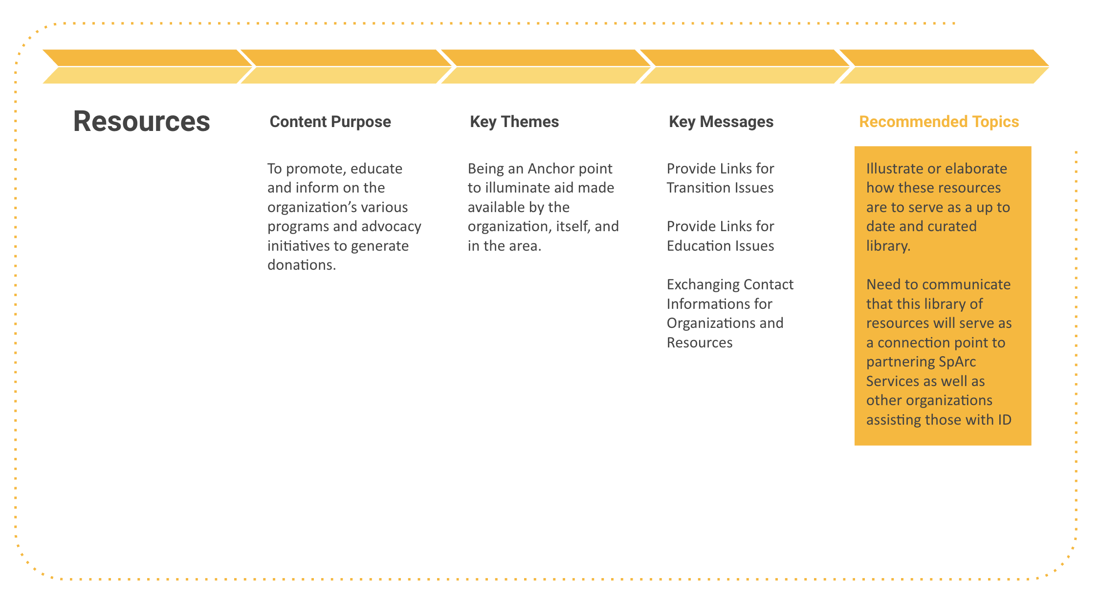
Content Strategy:
At this stage of our research, the content strategy allows Key Themes, Key Messages and the overall Purpose of the Content to come to the surface. With this information in hand then we are then able to see potential gaps in the content and make suggestions and recommend topics to fill these gaps.
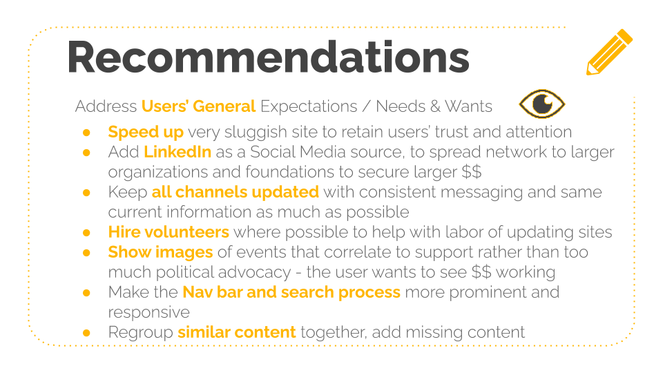
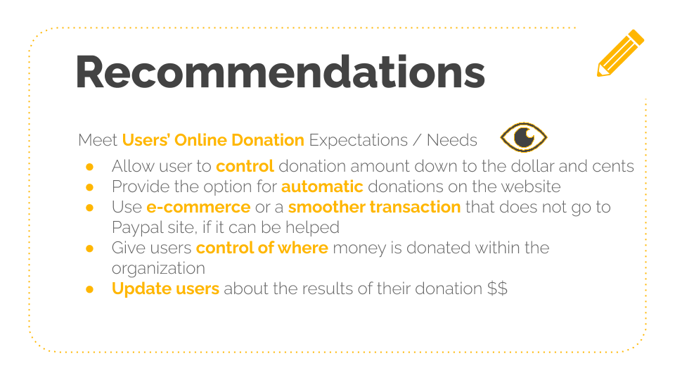
Recommendations:
After much user research and execution of UX methodologies, our findings are gathered and presented to the staff at The Arc of Philadelphia. These findings will lead to new sources of donations / funding and improve current sources through the website and social media channels.
The Data Model:
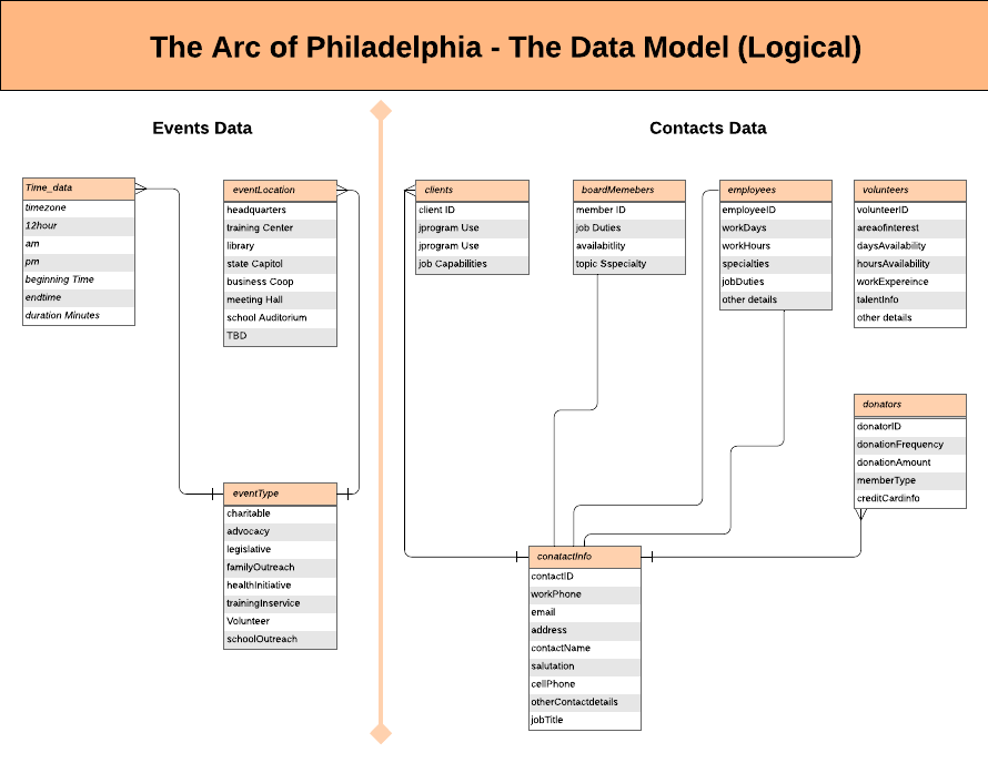
Mapping out the a data model helps design the database at the conceptual, physical and logical levels. Data Model structure helps to define the relational tables, primary and foreign keys and stored procedures for improved Information Architecture.
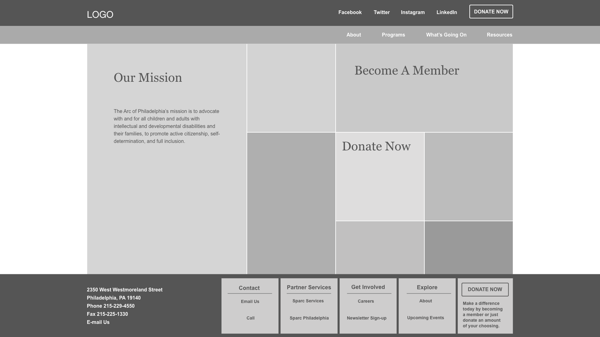
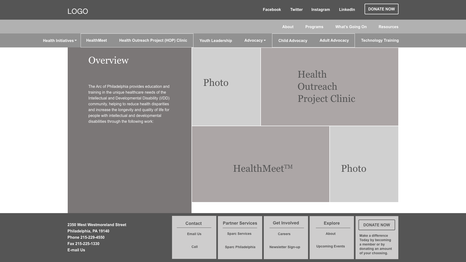
Preliminary Wireframing the Navigation:
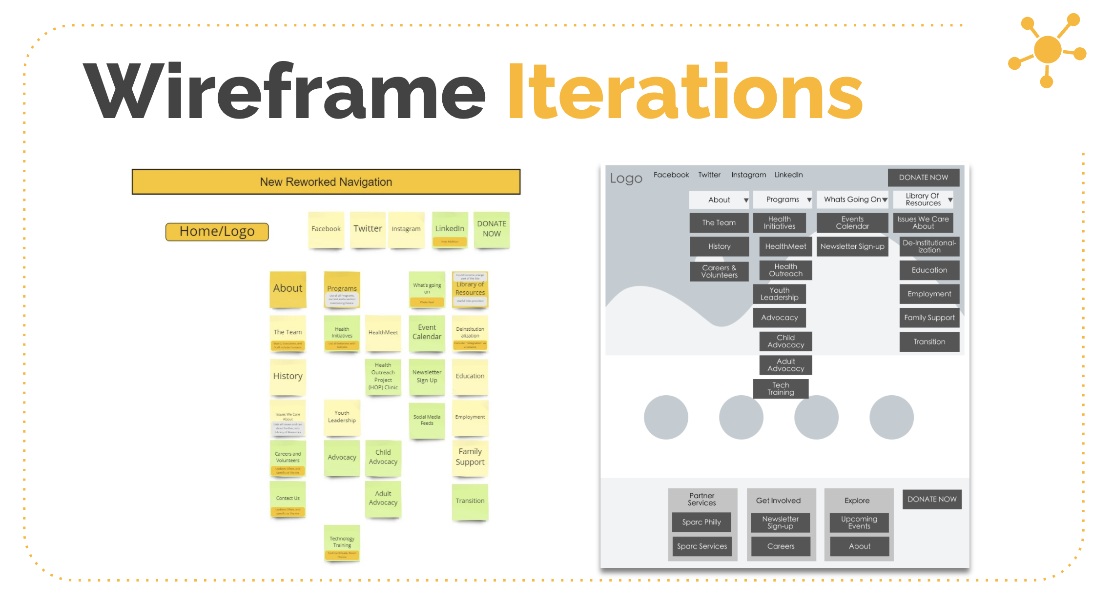
Rebuilding the navigation through wireframing is an essential step that leads to further clarification will give content strategy life.
Prototyping the navigation:
Below we were able to construct finalized wireframes of The Arc’s newly proposed global and local navigation.

Recommended solutions for our client:
After much research, testing and designing we have come up with the following solution sets, that will meet the needs of The Arc of Philadelphia and its users.
Solution 1: Web Browser Extension
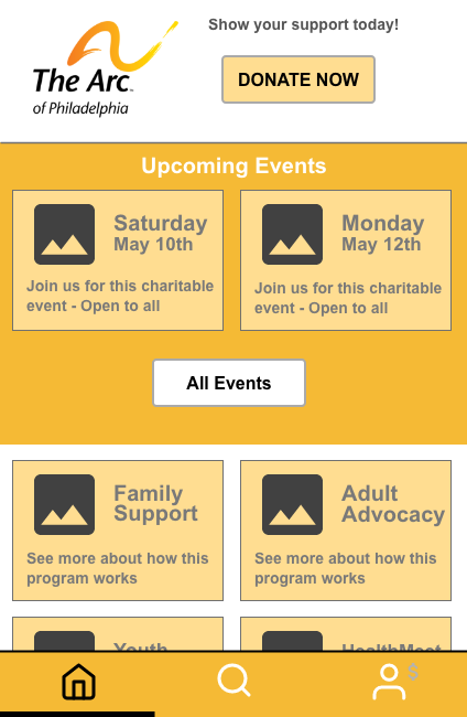
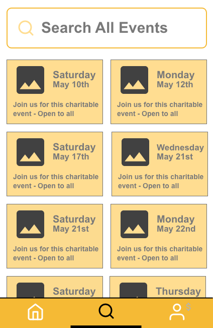
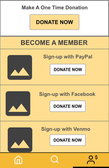
Below is one of the recommended solutions of a web browser extension that allows users of the Arc’s website to be able to get to the most important part of the content offered. Here we can make quick donations based on our preferred payment method, search the upcoming charitable events and a way to investigate the various human services and programs quickly.
